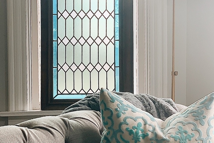
Now that I’m getting somewhere in the explaining of this restoration process, I’m very excited to start writing about all the beauty we are bringing out of the spaces. One of my favorite rooms in the house is the parlor. It’s such a beautiful room. It is filled with many elements of beauty. Two sets of pocket doors, our one and only stain glass window in the home, and the most incredible fireplace mantle. So much beauty in Victorian homes. Just one of the many reasons why I love these historic houses so much.
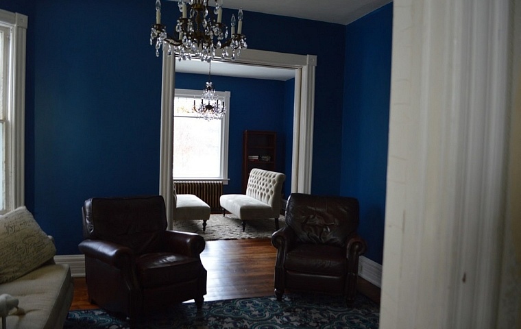
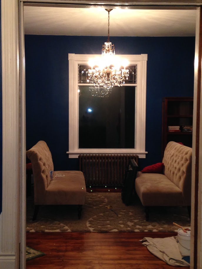
I wanted the living room and parlor to feel like one big space. They’re two very separate spaces, but I wanted them to flow well together. I choose the same color for both rooms, a very moody dark blue. “Regatta” from Sherwin Williams. It’s the perfect dark grey blue. I loved the drama it brought to these spaces. The ceilings in this house are so tall and every room has extremely large windows. I knew these spaces could handle bold colors.
I know it isn’t the most traditional color for a “farmhouse” but this is a victorian farmhouse, and it’s a mix of both. It’s not an extremely fancy victorian like some victorians, and it’s not extremely simple like many farmhouses. It’s the best of both worlds. A big part of my vision in this home is drama. I could easily decorate this house to be “shabby chic” or “rustic” or like Hobby Lobby threw up inside, but I’m going for a different feel. Don’t get me wrong. I do like that look. However, I feel like it is SO overdone these days. It all looks the same in my opinion. I did do a lot of that in the Bungalow, however a Victorian deserves so much more glamour in my opinion. It is hard to find the right balance, because I don’t want it to feel too fancy or like a grandmothers house. I have two small boys who are growing up in this house, it sure needs to be functional.
The trim in the home was painted almost everywhere. The only wood that was not painted is the staircase and the woodwork in the dining room minus one window. (Apparently they stripped the woodwork in that room but didn’t finish the last window.) Margaret, the previous owner told me that at some point, they took apart the entire staircase and took it somewhere to have it stripped. So apparently the staircase was painted when they bought the home 60 years prior. So, had the woodwork not been painted already, I would not be painting over it. I do like painted wood work, but in the bungalow house, we stripped LOTS of beautiful craftsman woodwork. And believe me. Once you’ve stripped woodwork with a heat gun and many burns later, you wouldn’t dare paint beautiful wood ever again. But, the victorian home IS painted. A large variety of the rainbow actually. Almost every room a different color. We choose a crisp white for the woodwork. The beauty of painted woodwork, is that it makes all the detail of the ten inch base boards pop. All those lines are just amazing. I used to think we would strip all the wood at some point, but I think I do prefer the white. It makes it all seem so crisp and perfect. It does suck to clean though.
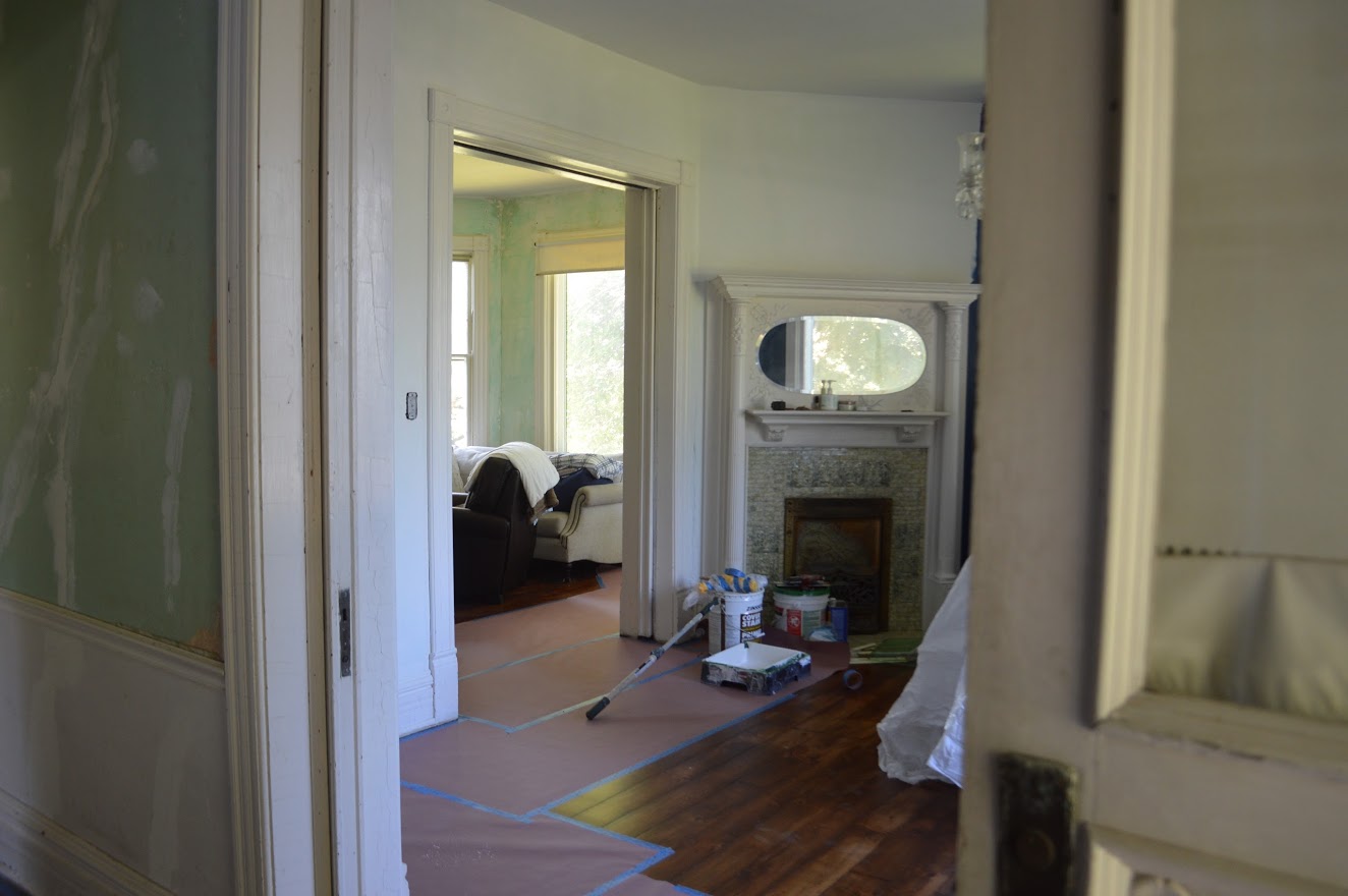
standing in foyer looking into parlor
We finally made it to the point after stripping wallpaper, scraping glue off the walls, plaster repair,and then priming. Wow glad that’s over.
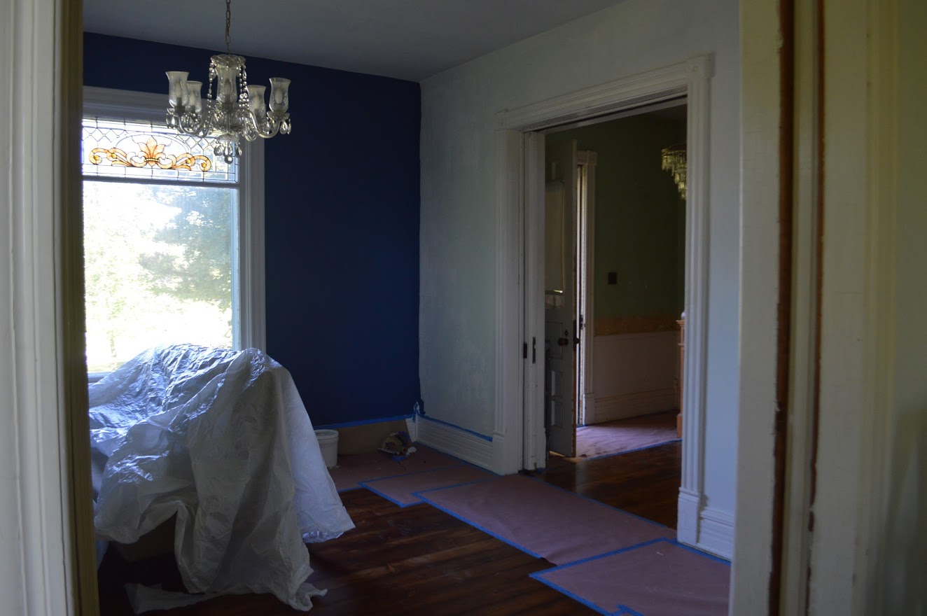
standing in living room looking into parlor
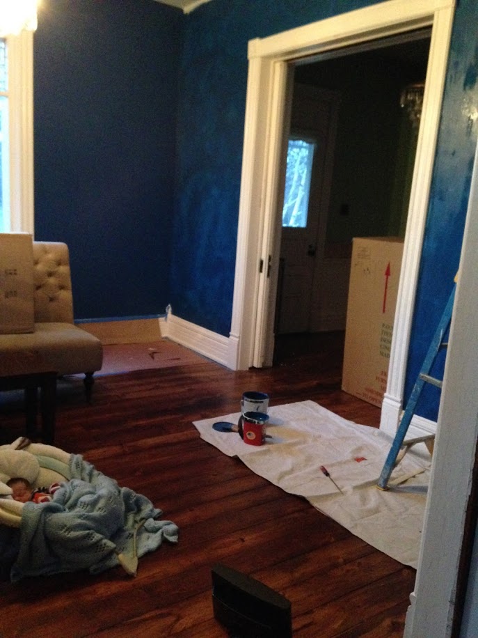
notice baby Cash in his chair only weeks old
I was in LOVE with the color on the walls. My vision was coming to life. In this photo, the blue looks extremely bright. It’s more of a moody blue in my opinion. It felt glamorous and victorian yet simple all at the same time. One thing I really pride my decorating style on is simplicity. I’m a wannabe minimalist. I like bold paint, bold rugs, and simple furniture and wall decor. I love victorian homes for the beauty in their craftsmanship. Not gaudy over the top drapes, decorating, or furniture. It’s just not my style. I don’t want to hide the beauty the home has with so many distractions. I want the woodwork, windows, lights, doors, and victorian details to all shine. I don’t like them to blend in, like many home victorian houses have. I understand that many of those elements were original to Victorian culture and decor, but I want to make this gem shine like it never has before. I like that look for a museum or in true restoration. But not in everyday life.
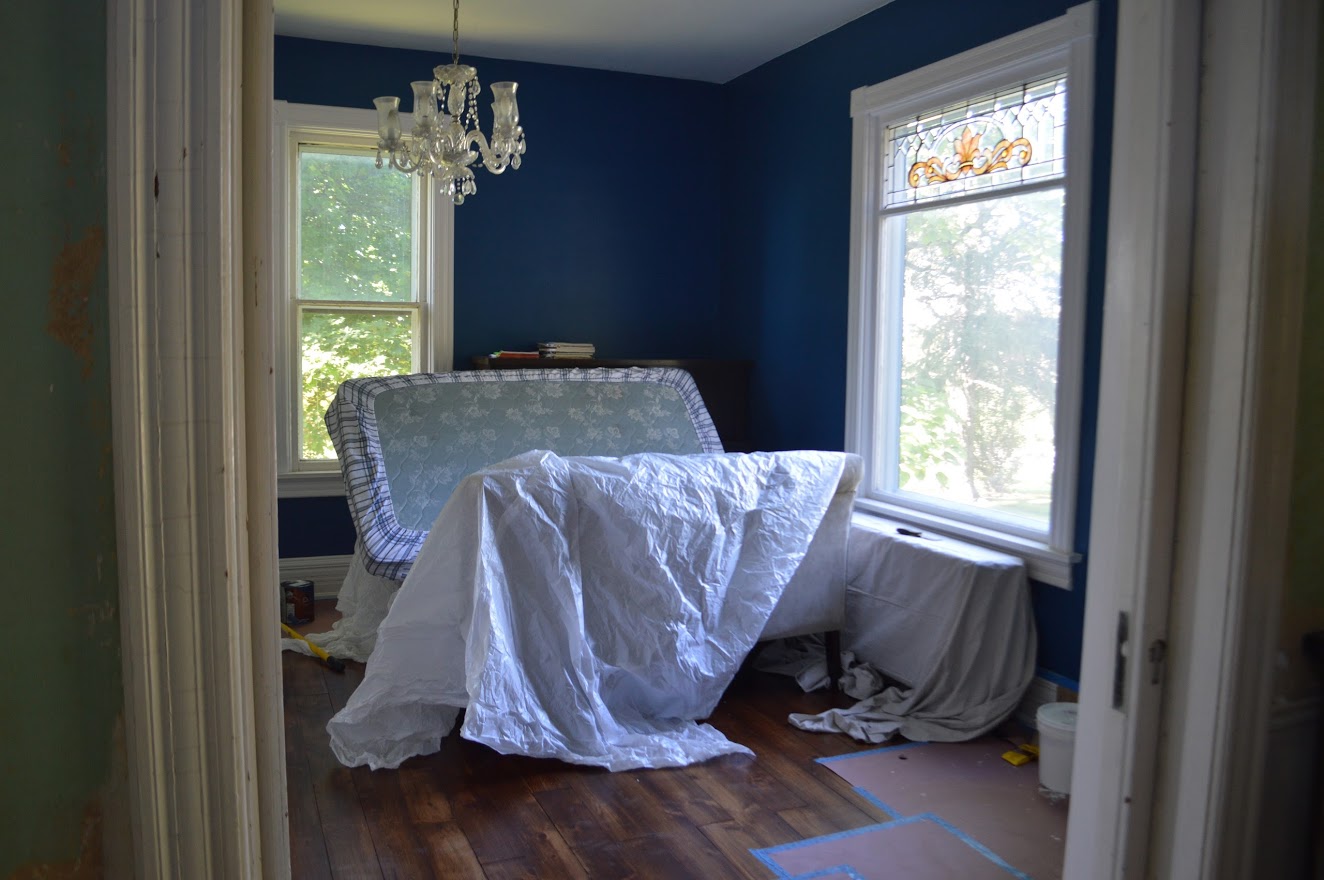
looking into parlor from foyer
Now one of the things that HAD to go in this room was that light. First of all, it was plastic. Yes I said plastic. Barf central. It had grapes etched into the globes and was hideous. I was on the hunt to find a chandelier that went with the chandelier in the living room, but obviously a new version. I am very much a internet bargain hunter, and have great luck with www.overstock.com . I get so many things from there. The secrets to overstock is you have to hunt and hunt. You have to look through hundreds of pages to find good things. I love it because it’s extremely fast shipping, usually free, and i’ve always had wonderful luck with the website. I used it for many things in the bungalow house as well. I was able to Find the most beautiful chandelier on overstock.com since it never fails me. I can’t tell you how many people ask us if it’s original. Most people also don’t understand that when our home was brand new, it most likely had gas lighting and fixtures.

parlor
parlor
It’s funy how quick my style has changed in a short two years. These two settee benches that you see, are both from World Market. I believe they’re actually supposed to be used for a dining room table. However, I got sick of these and realized they were completely unpractical. They looked pretty in photos, but they just weren’t the right thing for the space. I ended up selling them to a photographer friend of mine, and she uses them in her studio. They fit her space much better then they fit mine. That very amazing thick shag rug you see, was from the very wonderful www.overstock.com.

looking from living room into parlor
Quite the improvement i’d saying coming from where we started…
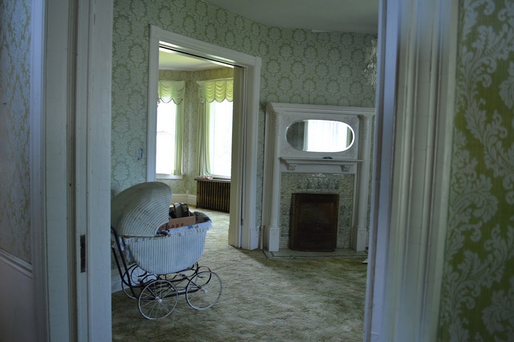
parlor move in day, before
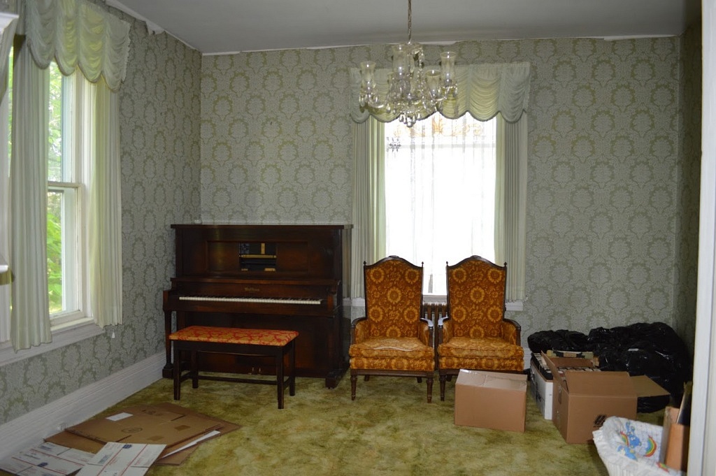
parlor move in day before
I am so pleased to see the progress we’ve made in this home in the short two years we’ve been here. I hope that the original owners of the home are pleased with their home, and happy to see us trying to bring all the beauty back into it.


